hypothesis_testing.py

#

So far, we've plotted and visualized data in various ways. Today, we'll see how to statistically back up some of the observations we've made in looking at our data. Statistics is a tool that helps separate newsmaking data-backed stories from one-off anecdotes. Usually, both kinds of stories start with a hunch, and statistics helps us quantify the evidence backing that hunch.

Whenever you have a hunch (a hypothesis in statistician-speak), the first thing to do is to look at some summary statistics (e.g., averages), and explore the data graphically as we did yesterday. If the visualizations seem to support your hunch, you will move into hypothesis-testing mode.

Two Running Examples

For our first set of tests, we're going to use two running examples: campaign spending and a fun comparison of two towns' citizens' heights. Here are the two scenarios:

Comparing Averages

Let's start by comparing a simple statistic, to see if in the data we observe there's any difference. We'll start by comparing the average heights of the two towns. (As an aside: it would help if you wrote and ran your code in dataiap/day3/ today, since several modules like ols.py are available in that directory).

import numpy
town1_heights = [5, 6, 7, 6, 7.1, 6, 4]
town2_heights = [5.5, 6.5, 7, 6, 7.1, 6]

town1_mean = numpy.mean(town1_heights)
town2_mean = numpy.mean(town2_heights)

print "Town 1 avg. height", town1_mean
print "Town 2 avg. height", town2_mean

print "Effect size: ", abs(town1_mean - town2_mean)
#

It looks like town 2's average height (6.35 feet) is higher than town 1 (5.87 feet) by a difference of .479 feet. This difference is called the effect size . Town 2 certainly looks taller than Town 1!

#

Exercise Compute the average campaign contribution for the Obama and McCain campaigns from the dataset in day 1. What's the effect size? We have an average contribution of $423 for McCain and $192 for Obama, for an effect size of $231. McCain appears, on average, to have more giving donors.

#

Before we fire up the presses on either of these stories, let's look at the data in more depth.

Graph The Data

If you finished yesterday's histogram exercise, then feel free to skip down to the box plot section

The effect size in both of our examples seems large. It would be nice to more than just compare averages. Let's try to look at a histogram of the distributions. We created a histogram of the two campaigns contributions, binned by $100 increments.

import matplotlib.pyplot as plt
from collections import Counter


increment = 1
width= .25

town1_bucketted = map(lambda ammt: ammt - ammt%increment, town1_heights)
town2_bucketted = map(lambda ammt: ammt - ammt%increment + width, town2_heights)
town1_hist = Counter(town1_bucketted)
town2_hist = Counter(town2_bucketted)

minamount = min(min(town1_heights), min(town2_heights))
maxamount = max(max(town1_heights), max(town2_heights))
buckets = range(int(minamount), int(maxamount)+1, increment)

fig = plt.figure()
sub = fig.add_subplot(111)
sub.bar(town1_hist.keys(), town1_hist.values(), color='b', width=width, label="town 1")
sub.bar(town2_hist.keys(), town2_hist.values(), color='r', width=width, label="town 2")
sub.legend()
plt.savefig('figures/town_histograms.png', format='png')
#

This results in a histogram that looks like this:

A histogram comparing both towns' heights

Not bad! The buckets are all exactly the same size except for one person of height between 4 and 5 feet in town 1.

#

Exercise Build a histogram for the Obama and McCain campaigns. This is challenging, because there are a large number of outliers that make the histograms difficult to compare. Add the line

sub.set_xlim((-20000, 20000))
#

before displaying the plot in order to set the x-values of the histogram to cut off donations larger than $20,000 or smaller than -$20,000 (refunds). With bar widths of 50 and increments of $100, your histogram will look something like this:

A histogram comparing the McCain and Obama 2008 campaign contributions

Ouch! I can't make heads or tails of that. It seems like Obama has a larger number of small donations, but there isn't a lot of granularity at that scale. For large datasets, a histogram might have too much information on it to be helpful. Luckily, descriptive statisticians have a more concise visualization. It's called a box-and-whisker plot! The code for it is quite simple as well:

import matplotlib.pyplot as plt

fig = plt.figure()
sub = fig.add_subplot(111)
sub.boxplot([town1_heights, town2_heights], whis=1)
sub.set_xticklabels(("Town 1", "Town 2"))
sub.set_title("Town 1 vs. Town 2 Heights")
plt.savefig('figures/town_boxplots.png', format='png')
#

Here's what we see:

Boxplots of the towns' heights

Let's interpret this plot. We show town 1 on the left and town 2 on the right. Each town is represented by a box with a red line and whiskers.

If normal distributions are your thing, this image might help you interpret the box-and-whiskers plot.

Like in the histogram, we see that the towns' height distributions don't look all that different from one-another. Generally, if the boxes of each distribution overlap, and you haven't taken something on the order of a buttload (metric units) of measurements, you should doubt the differenes in distribution averages. It looks like a single height measurement for town 1 is pretty far away from the others, and you should investigate such measurements as potential outliers.

#

Exercise Build a box-and-whiskers plot of the McCain and Obama campaign contributions. Again, outliers make this a difficult task. With whis=1 , and by setting the y range of the plots like so

sub.set_ylim((-250, 1250))
#

we got the following plot

Boxplots of McCain and Obama 2008 campaign contributions

Obama is on the left, and McCain on the right. Real data sure is more confusing than fake data! Obama's box plot is a lot tighter than McCains, who has a larger spread of donation sizes. Both of Obama's whiskers are visible on this chart, whereas only the top whisker of McCain's plot is visible. Another feature we haven't seen before is the stream of blue dots after each of the whiskers on each of Obama and McCain's plots. These represent potential outliers , or values that are extreme and do not represent the majority of the dataset.

It was easy to say that the histograms and box plots for the town heights overlapped heavily. So while the effect size for town heights was pretty large, the distributions don't actually look all that different from one-another.

The campaign plots are a bit harder to discern. The histogram told us virtually nothing. The box plot showed us that Obama's donations seemed more concentrated on the smaller end, whereas McCains seemed to span a larger range. There was overlap between the boxes in the plot, but we don't really have a sense for just how much overlap or similarity there is between these distributions. In the next section, we'll quantify the difference using statistics!

Run a Statistical Test

We have two population height averages. We know that they are different, but charts show that overall the two towns look similar. We have two campaign contribution averages that are also different, but with a murkier story after looking at our box-and-whisker plots. How will we definitively say whether the differences we observe are meaningful?

In statistics, what we are asking is whether differences we observed are reliable indicators of some trend, or just happened by lucky chance. For example, we might simply have measured particularly short members of town 1 and tall members of town 2. Statistical significance is a measure of the probability that, for whatever reason, we stumbled upon the results we did by chance.

There are several tests for statistical significance, each applying to a different question. Our question is: "Is the difference between the average height of people in town 1 and town 2 statistically significant?" We ask a similar question about the difference in average campaign contributions. The test that answers this question is the T-Test. There are several flavors of T-Test and we will discuss these soon, but for now we'll focus on Welch's T-Test.

import welchttest

print "Welch's T-Test p-value:", welchttest.ttest(town1_heights, town2_heights)
#

The Welch's T-Test emitted a p-value of .349 . A p-value is the probability that the effect size of .479 feet between town 1 and town 2 happened by chance. In this case, there's 34.9% chance that we've arrived at our effect size by chance.

What's a good cutoff for p-values to know whether we should trust the effect size we're seeing? Two popular values are .05 or .01: if there is less than a 5% or 1% chance that we arrived at our answer by chance, we're willing to say that we have a statistically significant result.

So in our case, our result is not significant. Had we taken more measurements, or if the differences in heights were farther apart, we might have reached significance. But, given our current results, let's not jump to conclusions. After all, it was just food coloring in the water!

#

Exercise Run Welch's T-test on the campaign data. Is the effect size between McCain and Obama significant? By our measurements, the p-value reported is within rounding error of 0. That's significant by anyone's measure: there's a near-nonexistant chance we're seeing this difference between the candidates by some random fluke in the universe. Time to write an article!

#

Can You Have a Very Significant Result?

No. There is no such thing as "very" or "almost" significant. Remember: the effect size is the interesting observation, and it's up to you what makes for an impressive effect size depending on the situation. You can have small effects, large effects, and everything in between. Significance testing tells us whether to believe that the observations we made happened by anything more than random chance. While people disagree about whether a p-value of .05 or .01 is required, they all agree that significance is a binary value.

#

Strictly speaking, you've learned about T-Tests at this point. If you are pressed for time, read Putting it all Together below and move on to the next section. For the overachievers in our midst, there's lots of important information to follow, and you can instead keep reading until the end.

#

Types of T-Test

The T-Test has two major flavors: paired and unpaired.

Sometimes your datasets are paired (also called dependent ). For example, you may be measuring the performance of the same set of students on an exam before and after teaching them the course content. To use a paired T-Test, you have to be able to measure an item twice, usually before and after some treatment. This is the ideal condition: by having before and after measurements of a treatment, you control for other potential differences in the items you mentioned, like performance between students.

Other times, you are measuring the difference between two sets of measured data, but the individual measurements in each dataset are unpaired (sometimes called independent ). This was the 
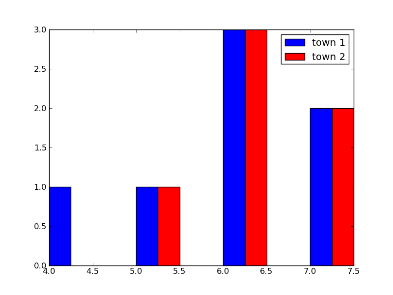
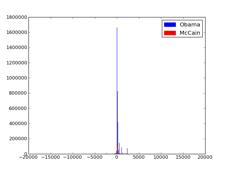
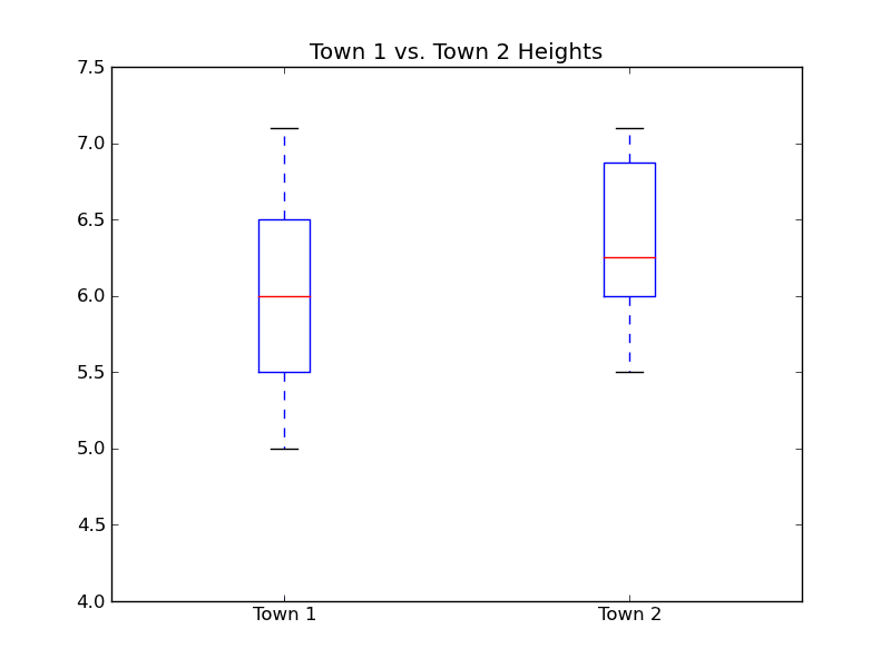
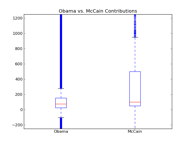
case in our tests: different people contributed to each campaign, and different people live in town 1 and 2. With unpaired datasets, we lose the ability to control for differences between individuals, so we'll likely need more data to achieve statistical significance.

Unpaired datasets come in all flavors. Depending on whether the sizes of the sets are equal or unequal, and depending on whether the variances of both sets are equal, you will run different versionf of an unpaired T-Test. In our case, we made no assumptions about the sizes of our datasets, and no assumptions on their variances, either. So we went with an unpaired, unequal size, unequal variance test. That's Welch's T-Test.

As with all life decisions, if you want more details, check out the Wikipedia article on T-Tests. There are implementations of paired T-Tests and unpaired ones in scipy. The unequal variance case is not available in scipy, which is why we included welchsttest.py. Enjoy it!

T-Test Assumptions we Broke:(

We've managed to sound like smartypantses that do all the right things until this moment, but now we have to admit we broke a few rules. The math behind T-Tests makes assumptions about the datasets that makes it easier to achieve statistical significance if those assumptions are true. The big assumption is that the data we used came from a normal distribution.

The first thing we should have done is check whether or not our data is actually normal. Luckily, the fine scipy folks have implemented the Shapiro-Wilk test test for normality. This test calculates a p-value, that, if low enough (usually < 0.05), tells us there is a low chance the distribution is normal.

import scipy.stats

print "Town 1 Shapiro-Wilks p-value", scipy.stats.shapiro(town1_heights)[1]
#

With a p-value of .380, we don't have enough evidence that our town heights are not normally distributed, so it's probably fine to run Welch's T-Test

#

Exercise Test the campaign contribution datasets for normality. We found them to not be normal (p = .003 for Obama and .014 for McCain), which means we likely broke the normality assumption of Welch's T-Test. The statistics police are going to be paying us a visit.

#

This turns out to be OK for two reasons: T-Tests are resilient to breaking of the normality assumption, and, if you're really serious about your statistics, there are nonparametric equivalents that don't make normality assumptions. They are more conservative since they can't make assumptions about the data, and thus likely require a larger sample size to reach significance. If you're alright with that, feel free to run the Mann-Whitney U nonparametric version of the T-Test, which has a wonderful name.

import scipy.stats

print "Mann-Whitney U p-value", scipy.stats.mannwhitneyu(town1_heights, town2_heights)[1]
#

Remember: we don't need to run the Mann-Whitney U test on our town data, since it didn't exhibit non-normalcy. And besides, the p-value is .254. That's still not significant. This makes sense: our less conservative Welch's test was unable to give us significance, so we don't expect a more conservative test to magically find significance.

#

Exercise since we shouldn't be using Welch's T-Test on the campaign contribution data, run the Mann-Whitney U test on the data. Is the difference between the Obama and McCain contributions still significant?

#

We got a p-value of about 0, so you will still find the result to be statistically significant. A+ for you!

Putting it All Together

So far, we've learned the steps to test a hypothesis:

There's a lot more to statistics than T-Tests, which compare two datasets' averages. Next, we'll cover correlation between two datasets using linear regression.