regression.py

#

We hear about correlations every day. Various health outcomes are correlated with socioeconomic status. Iodine supplementation in infants is correlated with higher IQ. Models are 
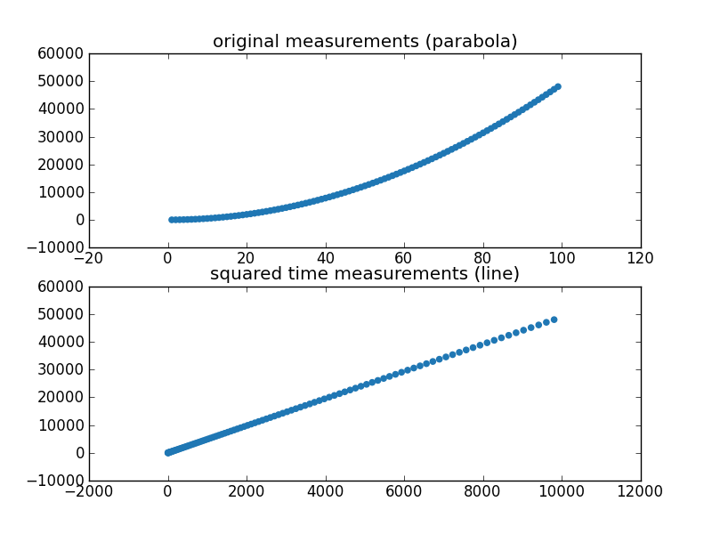
everywhere as well. An object falling for t seconds moves .5gt^2 
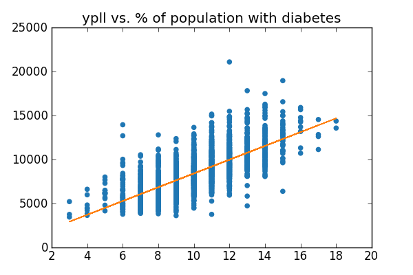
meters. You can calculate correlation and build approximate models using several techniques, but the simplest and most popular technique by far is linear regression . Let's see how it works!

County Health Rankings

For our examples, we'll use the County Health Rankings. Specifically, we'll be looking at two datasets in this example: Years of Potential Life Lost and Additional Measures.

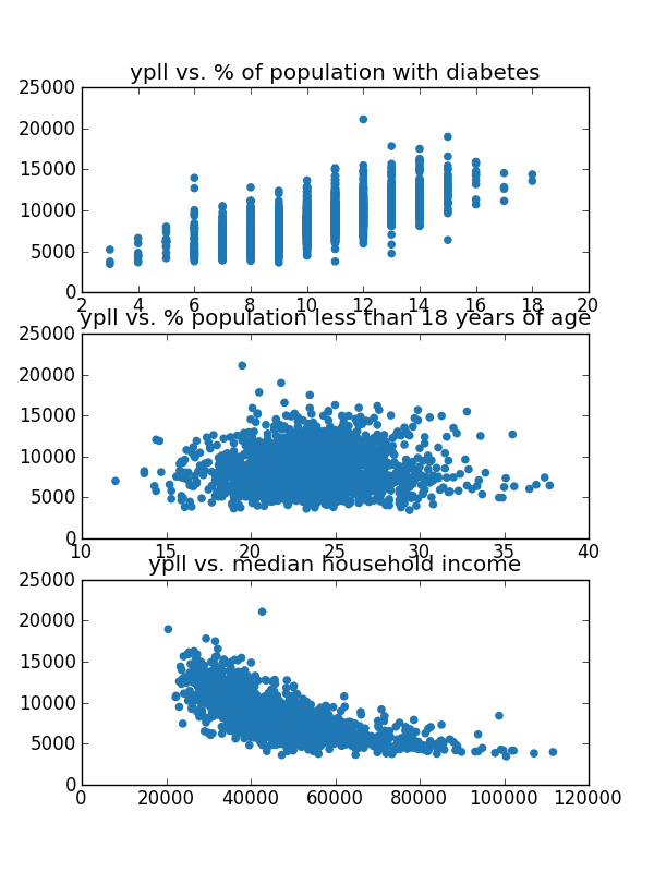
Years of potential life lost (YPLL) is an early mortality measure. It measures, across 100,000 people, the total number of years below the age of 75 that a 100,000-person group loses. For example, if a person dies at age 73, they contribute 2 years to this sum. If they die at age 77, they contribute 0 years to the sum. The YPLL for each 100,000 people, averaged across counties in the United States is between 8000 and 9000 depending on the year. The file ypll.csv contains per-county YPLLs for the United States in 2011.

The additional measures (found in additional_measures_cleaned.csv) contains all sorts of fun measures per county, ranging from the percentage of people in the county with Diabetes to the population of the county.

We're going to see which of the additional measures correlate strongly with our mortality measure, and build predictive models for county mortality rates given these additional measures.

Loading the Rankings

The two .csv files we've given you (ypll.csv and additional_measures_cleaned.csv) went through quote a bit of scrubbing already. You can read our notes on the process if you're interested.

We need to perform some data cleaning and filtering when loading the data. There is a column called "Unreliable" that will be marked if we shouldn't trust the YPLL data. We want to ignore those. Also, some of the rows won't contain data for some of the additional measures. For example, Yakutat, Alaska doesn't have a value for % child illiteracy. We want to skip those rows. Finally, there is a row per state that summarizes the state's statistics. It has an empty value for the "county" column and we want to ignore those rows since we are doing a county-by-county analysis. Here's a function, read_csv, that will read the desired columns from one of the csv files.

import csv

def read_csv(file_name, cols, check_reliable):
    reader = csv.DictReader(open(file_name, 'rU'))
    rows = {} # map "statename__countyname" to the column names in cols
    for row in reader:
        if check_reliable and row['Unreliable'] == "x": # discard unreliable data
            continue
        if row['County'] == "": # ignore the first entry for each state
            continue
        rname = "%s__%s" % (row['State'], row['County'])
        try: # if a row[col] is empty, float(row[col]) throws an exception
            rows[rname] = [float(row[col]) for col in cols]
        except:
            pass
    return rows
#

The function takes as input the csv filename, an array of column names to extract, and whether or not it should check and discard unreliable data. It returns a dictionary mapping each state/county to the values of the columns specified in cols. It handles all of the dirty data: data marked unreliable, state-only data, and missing columns.

When we call read_csv multiple times with different csv files, a row that is dropped in one csv file may be kept in another. We need to do what database folks call a join between the dict objects returned from read_csv so that only the counties present in both dictionaries will be considered.

We wrote a function called get_arrs that retrieves data from the YPLL and Additional Measures datasets. It takes the arguments dependent_cols, which is a list of column names to extract from ypll.csv, and independent_cols, which is a list of column names to extract from additional_measures_cleaned.csv. This function performs the join for you.

import numpy

def get_arrs(dependent_cols, independent_cols):
    ypll = read_csv("../datasets/county_health_rankings/ypll.csv", dependent_cols, True)
    measures = read_csv("../datasets/county_health_rankings/additional_measures_cleaned.csv", independent_cols, False)

    ypll_arr = []
    measures_arr = []
    for key, value in ypll.iteritems():
        if key in measures: # join ypll and measures if county is in both
            ypll_arr.append(value[0])
            measures_arr.append(measures[key])
    return (numpy.array(ypll_arr), numpy.array(measures_arr))
#

We return numpy arrays (matrices) with rows corresponding to counties and columns corresponding to the columns we read from the spreadsheet. We can finally call the get_arrs function to load the desired columns from each file.

dependent_cols = ["YPLL Rate"]
independent_cols = ["Population", "< 18", "65 and over", "African American",
                    "Female", "Rural", "%Diabetes" , "HIV rate",
                    "Physical Inactivity" , "mental health provider rate",
                    "median household income", "% high housing costs",
                    "% Free lunch", "% child Illiteracy", "% Drive Alone"]

ypll_arr, measures_arr = get_arrs(dependent_cols, independent_cols)
print ypll_arr.shape
print measures_arr[:,6].shape

exit()
#

Phew. That sucked. Let's look at the data!

#

Look at a Scatterplot

Like we did during hypothesis testing, our first step is to look at the data to identify correlations. The best visualization to identify correlations is a scatterplot, since that shows us the relationship between two potentially related variables like ypll and % diabetes.

Let's start by looking at scatterplots of ypll versus three potentially correlated variables: % of a community that has diabetes, % of the community under the age of 18, and median income.

import matplotlib.pyplot as plt

fig = plt.figure(figsize=(6, 8))

subplot = fig.add_subplot(311)
subplot.scatter(measures_arr[:,6], ypll_arr, color="#1f77b4") # :,6 means all rows of "diabetes"
subplot.set_title("ypll vs. % of population with diabetes")

subplot = fig.add_subplot(312)
subplot.scatter(measures_arr[:,1], ypll_arr, color="#1f77b4") # 1 = age
subplot.set_title("ypll vs. % population less than 18 years of age")

subplot = fig.add_subplot(313)
subplot.scatter(measures_arr[:,10], ypll_arr, color="#1f77b4") # 10 = income
subplot.set_title("ypll vs. median household income")

plt.savefig('figures/three-scatters.png', format='png')
#

what's measures_arr[:,6]? That's a numpy supported syntax to extract a subset of a matrix. The first argument specifies which rows to extract. It can be a number (like 3), a python slice (:3 means the rows from 0 to 3, while 3:5 means 3 to 5), or :, which means all of the rows. The second argument specifies which columns to extract. In this case it is 6, which is the 7'th column (remember, it's 0 indexed).

Your plots should look something like this:

YPLL vs. population with diabetes, population less than 18 years of age, and median household income

We picked these three examples because they show visual evidence of three forms of correlation:

#

Exercise Look at scatter plots of other variables vs. YPLL. We found the percent of children eligible for school lunch to be alarmingly correlated with YPLL!

#

Your First Regression

It's time we turn the intuition from our scatterplots into math! We'll do this using the ols module, which stands for ordinary least squares regression. Let's run a regression for YPLL vs. % Diabetes.

import ols


model = ols.ols(ypll_arr, measures_arr[:,6], "YPLL Rate", ["% Diabetes"]) # 6 = diabetes
model.summary()
#

the ols script in dataiap/day3/ implement a method called ols() that takes four arguments:

  1. a 1-dimensional numpy array containing the values of the dependent variable (e.g., YPLL)
  2. a 2-dimensional numpy array where each row contains the values of an independent variable. In this case the only independent variable is "% Diabetes", so the matrix has the same shape as ypll_arr.
  3. The label for the first argument
  4. A list of labels for each row in the second argument

As you can see, running the regression is simple, but interpreting the output is tougher. Here's the output of model.summary() for the YPLL vs. % Diabetes regression:

 ======================================================================  
 Dependent Variable: YPLL Rate  
 Method: Least Squares  
 Date:  Fri, 23 Dec 2011

 Time:  13:48:11
 # obs:                2209
 # variables:         2
 ======================================================================
 variable     coefficient     std. Error      t-statistic     prob.
 ======================================================================
 const           585.126403      169.746288      3.447064      0.000577
 %Diabetes       782.976320      16.290678      48.062846      0.000000
 ======================================================================
 Models stats                         Residual stats
 ======================================================================
 R-squared             0.511405         Durbin-Watson stat   1.951279
 Adjusted R-squared    0.511184         Omnibus stat         271.354997
 F-statistic           2310.037134      Prob(Omnibus stat)   0.000000
 Prob (F-statistic)    0.000000         JB stat              559.729657
 Log likelihood       -19502.794993     Prob(JB)             0.000000
 AIC criterion         17.659389        Skew                 0.752881
 BIC criterion         17.664550        Kurtosis             4.952933
 ======================================================================

Let's interpret this:

Putting this all together, we've just discovered that, without knowing the YPLL of a community, we can take data on the percentage of people affected by diabetes, and roughly reconstruct 51% of the YPLL's characteristics.

If you want to use the information in your regression to do more than print a large table, you can access the data individually

print "p-value", model.Fpv
print "coefficients", model.b
print "R-squared and adjusted R-squared:", model.R2, model.R2adj
#

To better visualize the model we've built, we can also plot the line we've calculated through the scatterplot we built before

fig = plt.figure(figsize=(6, 4))

subplot = fig.add_subplot(111)
subplot.scatter(measures_arr[:,6], ypll_arr, color="#1f77b4") # 6 = diabetes
subplot.set_title("ypll vs. % of population with diabetes")

def best_fit(m, b, x): # calculates y = mx + b
    return m*x + b

line_ys = [best_fit(model.b[1], model.b[0], x) for x in measures_arr[:,6]]
subplot.plot(measures_arr[:, 6], line_ys, color="#ff7f0e")

plt.savefig('figures/scatter-line.png', format='png')
#

That should result in a plot that looks something like

Scatterplot with best-fit line

We can see that our line slopes upward (the beta coefficient in front of the %Diabetes term is positive) indicating a positive correlation.

#

Exercise Run the correlations for percentage of population under 18 years of age and median household income.

#

We got statistically significant results for all of these tests. Median household income is negatively correlated (the slope beta is -.13), and explains a good portion of YPLL (R-squared is .48). Remember that we saw a blob in the scatterplot for percentage of population under 18. The regression backs this up: the R-squared of .005 suggests little predictive power of YPLL.

#

Exercise Plot the lines calculated from the regression for each of these independent variables. Do they fit the models?

#

Exercise Run the correlation for % of children eligible for school lunches. Is it significant? Positively or negatively correlated? How does this R-squared value compare to the ones we just calculated?

#

Explaining R-squared

R-squared roughly tells us how well the linear model (the line) we get from a linear regression explains the independent variable.

R-squared values have several interpretations, but one of them is as the square of a value called the Pearson Correlation Coefficient. That last link has a useful picture of the correlation coefficient that shows you the value of R for different kinds of data.

Squaring R makes it always positive and changes its asymptotic properties, but the same trends (being near 0 or near 1) still apply.

Running Multiple Variables

So far, we've been able to explain about 50% of the variance in YPLL using our additional measures data. Can we do better? What if we combine information from multiple measures? That's called a multiple regression, and we already have all the tools we need to do it! Let's combine household income, %Diabetes, and percentage of the population under 18 into one regression.

dependent_cols = ["YPLL Rate"]
independent_cols = ["< 18", "%Diabetes" , "median household income"]
ypll_arr, measures_arr = get_arrs(dependent_cols, independent_cols)
model = ols.ols(ypll_arr, measures_arr, "YPLL Rate", independent_cols)
print "p-value", model.Fpv
print "coefficients", model.b
print "R-squared and adjusted R-squared:", model.R2, model.R2adj
#

We got the following output:

 p-value 1.11022302463e-16  
 coefficients [  4.11471809e+03   1.30775027e+02   5.16355557e+02  -8.76770577e-02]  
 R-squared and adjusted R-squared: 0.583249144589 0.582809842914

So we're still significant, and can read the rest of the output. A read of the beta coefficients suggests the best linear combination of all of these variables is YPLL = 4115 + 131(% under 18) + 516(% Diabetes) - 877*(median household income) .

#

Because there are multiple independent variables in this regression, we should look at the adjusted R-squared value, which is .583. This value penalizes you for needlessly adding variables to the regression that don't give you more information about YPLL. Anyway, check out that R-squared---nice! That's larger than the R-squared value for any one of the regressions we ran on their own! We can explain more of YPLL with these variables.

#

Exercise Try combining other variables. What's the largest adjusted R-squared you can achieve? We can reach .715 by an excessive use of variables. Can you replicate that?

#

Eliminate Free Lunches, Save the Planet

At some point in performing a regression and testing for a correlation, you will be tempted to come up with solutions to problems the regression has not identified. For example, we noticed that the percentage of children eligible for free lunch is pretty strongly correlated with the morbidity rate in a community. How can we use this knowledge to lower the morbidity rate?

ALERT, ALERT, ALERT!!! The question at the end of the last paragraph jumped from a question of correlation to a question of causation.

It would be far-fetched to think that increasing or decreasing the number of children eligible for school lunches would increase or decrease the morbidity rate in any significant way. What the correlation likely means is that there is a third variable, such as available healthcare, nutrition options, or overall prosperity of a community that is correlated with both school lunch eligibility and the morbidity rate. That's a variable policymakers might have control over, and if we somehow improved outcomes on that third variable, we'd see both school lunch eligibility and the morbidity rate go down.

Remember: correlation means two variables move together, not that one moves the other.

#

We've hit the point that if you're stressed for time, you can jump ahead to the closing remarks. Realize, however, that there's still mind-blowing stuff ahead, and if you have time you should read it!

#

Nonlinearity

Is finding a bunch of independent variables and performing linear regression against some dependent variable the best we can do to model our data? Nope! Linear regression gives us the best line to fit through the data, but there are cases where the interaction between two variables is nonlinear. In these cases, the scatterplots we built before matter quite a bit!

Take gravity for example. Say we measured the distance an object fell in a certain amount of time, and had a bit of noise to our measurement. Below, we'll simulate that activity by generating the time-distance relationship that we learned in high school (displacement = .5gt^2). Imagine we record the displacement of a ball as we drop it, storing the time and displacement measurements in timings and displacements.

timings = range(1, 100)
displacements = [4.9*t*t for t in timings]
#

A scatterplot of the data looks like a parabola, which won't fit lines very well! We can transform this data by squaring the time values.

sq_timings = [t*t for t in timings]

fig = plt.figure()
subplot = fig.add_subplot(211)
subplot.scatter(timings, displacements, color="#1f77b4")
subplot.set_title("original measurements (parabola)")

subplot = fig.add_subplot(212)
subplot.scatter(sq_timings, displacements, color="#1f77b4")
subplot.set_title("squared time measurements (line)")

plt.savefig('figures/parabola-linearized.png', format='png')
#

Here are scatterplots of the original and transformed datasets. You can see that squaring the time values turned the plot into a more linear one.

Original vs. Transformed Data

#

Exercise Perform a linear regression on the original and transformed data. Are they all significant? What's the R-squared value of each? Which model would you prefer? Does the coefficient of the transformed value mean anything to you?

#

For those keeping score at home, we got R-squared of .939 and 1.00 for the unadjusted and adjusted timings, which means we were able to perfectly match the data after transformation. Note that in the case of the squared timings, the equation we end up with is displacement = 4.9 * time^2 (the coefficient was 4.9), which is the exact formula we had for gravity. Awesome!

#

Exercise Can you improve the R-squared values by transformation in the county health rankings? Try taking the log of the population, a common technique for making data that is bunched up spread out more. To understand what the log transform did, take a look at a scatterplot.

#

Log-transforming population got us from R-squared = .026 to R-squared = .097.

Linear regression, scatterplots, and variable transformation can get you a long way. But sometimes, you just can't figure out the right transformation to perform even though there's a visible relationship in the data. In those cases, more complex technques like nonlinear least squares can fit all sorts of nonlinear functions to the data.

Where to go from here

Today you've swallowed quite a bit. You learned about significance testing to support or reject high-likelihood meaningful hypotheses. You learned about the T-Test to help you compare two communities on whom you've measured data. You then learned about regression and correlation, for identifying variables that change together. From here, there are several directions to grow.