Today, we will do more with matplotlib.
We will also learn to
In the exercises, we will use this to further visualize and analyze the campaign donations data.
matplotlib is quite powerful, and is intended to emulate matlab's visualization facilities. We will give you a basic understanding of how plotting works, which should be enough for a majority of the charts that you will want to create.
The dataset that we are working with is fairly large for a single computer, and it can take a long time to process the whole dataset, especially if you will process it repeatedly during the labs.
Use the sampling technique we discussed in yesterday's lab! You can change the sampling frequency (1000 yesterday) to change the size of the sample. Use 100 as a starting point, but realize the graphs we show are with sampling set to 1 (all rows are included).
Visualizations are used to succinctly and visually describe different parts or different interpretations of your data. They give the reader, who is not necessarily an expert in the dataset, an intuition of trends or relationships.
I typically use visualizations for two purposes:
The package we will be using is matplotlib.pyplot. It provides a lot of shorthands and defaults (we used some of them yesterday when making line charts), but today we will do things the "right way".
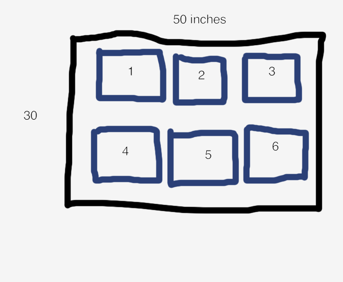
A figure is the area that we will draw in. We can specify that it is 50 inches wide and 30 inches tall.
import matplotlib.pyplot as plt
fig = plt.figure(figsize=(50, 30))
It is common to create multiple subfigures or subplots in a single figure. fig.add_subplot(nrows, ncols, i) tells the figure to treat the area as a nrows x ncols grid, and return an Axes object that represents the i'th grid cell. You will then create your chart by calling methods on object. It helps me to think of an Axes object as a subplot.
subplot1 = fig.add_subplot(2, 3, 1)
subplot2 = fig.add_subplot(2, 3, 2)
For example, the above code creates a figure with the following layout. The black box is the area of the figure, while each blue box is a subplot in a 2x3 grid. The number in a blue box is the subplot's index.
It's important to mention that add_subplot does not actually create a grid, it just finds the area in an imaginary grid where a subplot should be and return an object that represents the area. Thus it is possible to do draw on overlapping subplots. Be careful!
fig.add_subplot(2, 3, 1)
fig.add_subplot(2, 1, 1)
When you read matplotlib code on the internet, you will often see a shorthand for creating subplots when the subplot index, number of rows, and number of columns are all less than 10. fig.add_subplot(xyz) returns the z'th subplot in a x by y grid. So fig.add_subplot(231) returns the first subplot in a 2x3 grid.
The functions that we will be using to create charts are simply convenience functions that draw and scale points, lines, and polygons at x,y coordinates. Whenever we call a plotting method, it will return a set of objects that have been added to the subplot. For example, when we use the bar() method to create a bar graph, matplotlib will draw rectangles for each bar, and return a list of rectangle objects so that we can manipulate them later (e.g., in an animation).
As you use matplotlib, keep in mind that:
Let's get to drawing graphs! By the end of this tutorial, you will have experience creating bar charts, line charts, box plots, scatter plots, and choropleths (map plots). We will walk you through how to create a figure similar to
This figure creates subplots in a 3x2 grid, so let's first setup the figure and generate two sets of data. Both sets have the same x values, but different y values. Think "obama" and "mccain" from yesterday :)
import matplotlib.pyplot as plt
import random
random.seed(0)

fig = plt.figure(figsize=(50, 30))

N = 100
xs = range(N)
y1 = [random.randint(0, 50) for i in xs]
y2 = range(N)
Bar plots are typically used when you have categories of data that you want to compare. The subplot function is:
subplot.bar(left, height, width=0.8, bottom=None, **kwargs)
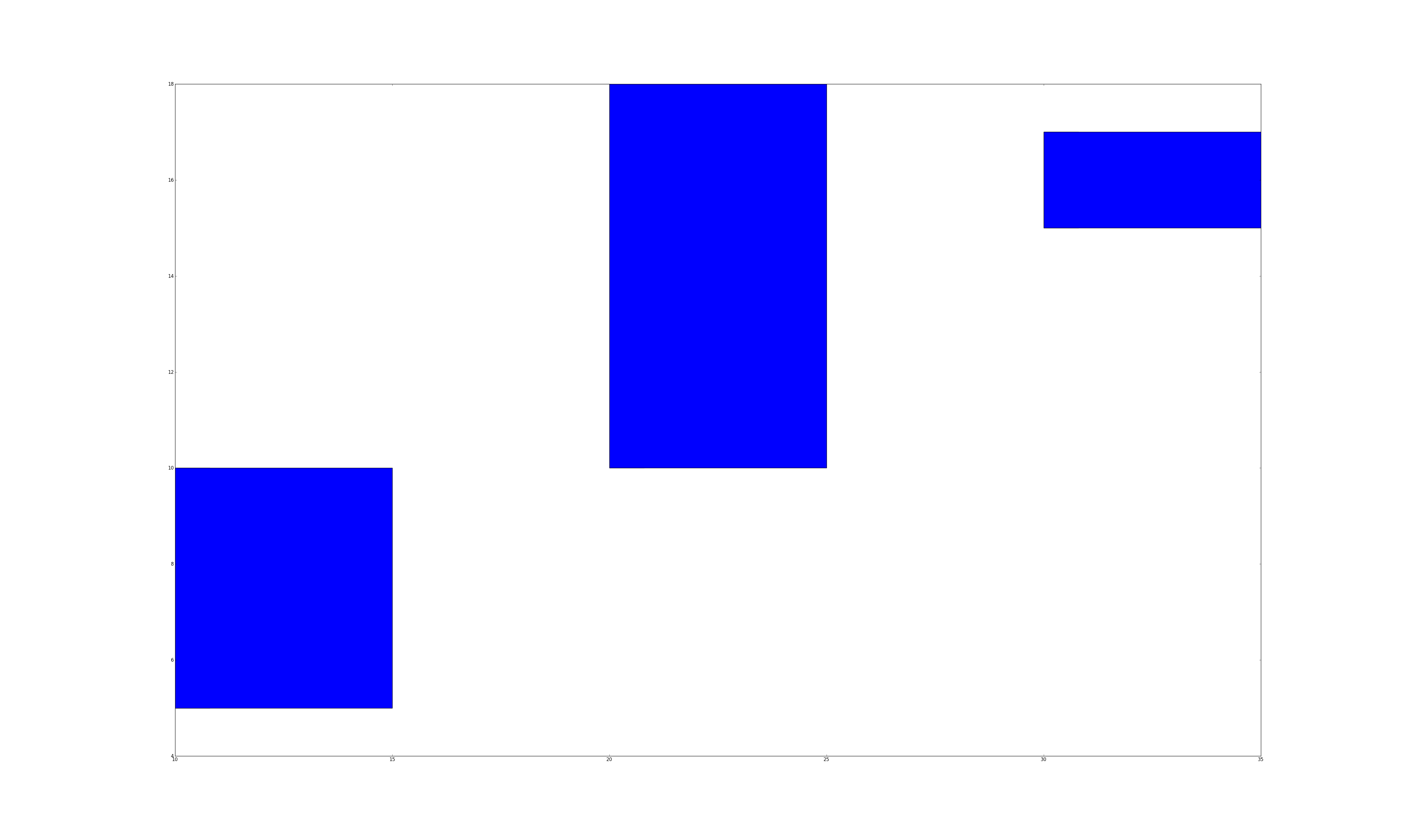
The bar plot function either takes a single left and height value, which will be used to draw a rectangle whose left edge is at left, and is height tall:
subplot.bar(10, 30) # left edge at 10, and the height is 30.
or you can pass a list of lefts values and a list of height values, and it will draw bars for each pair of left,height value. For example, the following will create three bars at the x coordinates 10, 20 and 30. The bars will be 5, 8, 2 units tall.
subplot.bar([10, 20, 30], [5, 8, 2])
matplotlib will automatically scale the x and y axes so that the figure looks good. While the numbers along the x and y axes depend on the values of left and height, the sizes of the bars just depend on their relative values. That's why we've used the word "unit" instead of "pixel".
The width keyword argument sets width of the bars It can be a single value, which sets the width of all of the bars, or a list that specifies the list of each bar. Set it relative to the differences of the left values. For example, the code above sets each bar 10 units apart (left=[10, 20, 30]), so I would set width = 10 / 2.0.
The bottom keyword argument specifies the bottom edge of the bars.
subplot.bar([10, 20, 30], [5, 8, 2], width=[5,5,5], bottom=[5, 10, 15])
What if you want to draw 2 sets of bars? We simply call subplot.bar() multiple times. However, we would need to set the left argument appropriately. If we used the same left list for all the calls, then the bars would be drawn on top of each other.
What if we want to shift the second set of bars by width units? One way to do this is to turn left into a numpy list. Numpy arrays let us perform math operations (e.g., +,-,/,*) on every element in the array, and matplotlib methods also accept numpy lists. So left+width adds width to every element in left, which serves to shift the second set of bars to the right by width units. The following code should reproduce the first subplot in the figure.
import numpy as np
left = np.arange(len(xs))
width = 0.25

subplot = fig.add_subplot(3,2,1)
subplot.bar(left, ys, width=width)
subplot.bar(left+width, ys2, width=width, bottom=ys)
You can further customize your bar charts using the following popular keyword arguments:
color='blue': set color to a hex value ("#ffffff"), a common color name ("green"), or a shade of grey ("0.8").linewidth=1: the width of the bar's border. set it to 0 to remove the border.edgecolor='blue': set the color of the bar's border.label='a name': give a set of bars a name. Later, we will teach you how to create legends that will display the labels.For example, the following would draw a set of red bars:
subplot.bar(left, ys, color='red')
Line plots are typically used when graphing data with two continuous dimensions. In addition, drawing the line implies that we can extrapolate values between adjacent points on the line. This is a key difference between line plots and scatter plots.
subplot.plot(xs, ys, **kwargs)
The plot command draws a line graph. It takes a list of x values and y values, and draws a line between every adjacent pair of points. Try it out using the data in the previous section.
subplot.plot(xs1, ys1, xs2, ys2, ...) is a convenient shorthand for:
subplot.plot(xs1, ys1)
subplot.plot(xs2, ys2)
...
To reproduce the line graph, we can simply write
subplot = fig.add_subplot(322)
subplot.plot(xs, ys1, xs, ys2)
You can also customize the lines using the keyword arguments:
color='green': same as color for bar graphsmarker=None: specify the marker to draw at each point. I commonly use '*', '+', '.' or 'o'. Set it to None to not draw markers. The documentation has a full list of the available markers.label='a name': give a line a name. I usually call plot() for each line if I want to give each one a name.boxplot(data)
Boxplots are used to summarize and compare groups of numerical data. Each box summarizes a set of numbers and depicts 5 parameters:
NOTE The words we are about to use might seem foreign to you. We will teach boxplots in depth tomorrow. We are just introducing how to draw box plots today, and will use them a whole lot tomorrow.
subplot.boxplot will automatically compute these values, and also ignore numbers that it thinks are outliers. Don't worry about when and why they are used -- we will discuss that tomorrow. Just know that one box summarizes a set of numbers.
Unlike the other charts, you can't draw each box individually. The data variable is either a list of numbers, in which case it will compute and draw a single box:
subplot.boxplot(range(10))
or data can be a list of lists. In which case, it will compute and draw a box for each list. The following code reproduces the box plot shown earlier. We create sets of data (boxdata1, boxdata2, boxdata3) and create a box for each set.
subplot = fig.add_subplot(323)
boxdata1 = [random.randint(0, 20) for i in xrange(10)]
boxdata2 = [random.randint(20,40) for i in xrange(10)]
boxdata3 = [random.randint(40,60) for i in xrange(10)]
data = [boxdata1, boxdata2, boxdata3]
subplot.boxplot(data)
You can customize your box plots with the following keyword arguments
vert=1: By default, the boxes are drawn vertically. You can draw them horizontally by setting vert=0widths=None: Like width in bar charts, this sets the width of each boxScatter plots are used to graph data along two continuous dimensions. In contrast to line graphs, each point is independent.
subplot.scatter(x, y, s=20, c='blue', marker='o', alpha=None)
This method will draw a single point if you give it a single x,y pair
subplot.scatter(10, 10)
or you can give it a list of x and a list of y values
subplot.scatter([0, 1, 2], [9, 3, 10])
I've included the commonly used keyword arguments
s=20: sets the size of each point to 20 pixels.c='blue': sets the color of each point to bluemarker='o': each point will be drawn as a circle. The documentation lists large number of other markersalpha=None: the alpha (transparency) value of the points. Between 0 and 1.linewidth=4: sets the width of the line around the point to 4 pixels. I usually set it to 0.Cartography is a very involved process and there is an enormous number of ways to draw the 3D world in 2D. Unfortunately, we couldn't find any native matplotlib facilities to easily draw US states and counties. It's a bit of a pain to get it working, so we've written some wrappers that you can call to draw colored state and counties in a subplot. We'll describe the api, and briefly explain how we went about the process at the end.
The API is defined in resources/util/map_util.py. You can import the methods using the following code:
import sys
# this adds the resources/util/ folder into your python path
# you may need to edit this so that the path is correct
sys.path.append('resources/util/')
from map_util import *
draw_county(subplot, fips, color='blue'): draws the county with the specified fips county code. Most datasets that contain per-county data will include the fips code. If you don't include a color, we will randomly pick a nice shade of blue for you.draw_state(subplot, state_name, color='blue'): draws the state with the full state name as specified by the official USPS state names. If you don't include color, we will pick a shade of blue for you.get_statename(abbr): retrieve the full state name from its abbreviation. The method is case insensitive, so get_statename('CA') is the same as get_statename('ca').We also included a list of all fips county codes and state names in datasets/geo/id-counties.json and datasets/geo/id-states.json. We will use them to reproduce the map charts.
import json

# Map of Counties
#
subplot = fig.add_subplot(325)
# data is a list of strings that contain fips values
data = json.load(file('../datasets/geo/id-counties.json'))
for fips in data:
    draw_county(subplot, fips)

# Map of States
#
subplot = fig.add_subplot(326)
data = json.load(file('../datasets/geo/id-states.json'))
for state in data:
    draw_state(subplot, state)
The files are in JSON format, so we call json.load(file), which parses the files into python lists. The rest of the code simply iterates through the fips' and states, and draws them.
The process of drawing maps yourself requires a number of steps:
json can parse it for us.subplot.fill(xs, ys) fills in the region defined by the list of x,y points.subplot.fill() accepts. So take a look at its documentation if you want to further customize your maps.We only touched a small part of what matplotlib can do. Here are some additional ways that you can customize subplots.
xerr=[]: list of floats that specify x-axis error bars.yerr=[]: list of floats that specify y-axis error barssubplot.loglog(xs, ys): plots a log-log line graphsubplot.semilogx(xs, ys): plots the x-axis in log scalesubplot.semilogy(xs, ys): plots the y-axis in log scalesubplot.fill(x1,y1,x2,y2,x3,y3,...): draws a filled polygon with vertices at (x1,y1), (x2,y2), ....subplot.text(x,y,text): write text at coordinates x,y.subplot.clear(): clear everything that has been drawn on the subplot.subplot.legend(loc='upper center', ncol=2) - add a legend. You can specify where to place it using loc, and the number of columns in the legend.subplot.set_title(text): Set the subplot title.subplot.set_xlabel(text): Set the x-axis labelsubplot.set_xticks(xs): Draws x-axis tick marks at the points specified by xs. Otherwise matplotlib will draw reasonable tick marks.subplot.set_xticklabels(texts): Draw x-axis tick labels using the texts list.subplot.set_xscale(scale): Sets the x-axis scaling. scale is 'linear' or 'log'.subplot.set_xlim(minval, maxval): Set the x-axis limitssubplot.set_ylabel()subplot.set_yticks()subplot.set_yticklabels()subplot.set_yscale()subplot.set_ylim(minval, maxval): Set the y-axis limitsThis document provides a good summary of what to think about when choosing colors.
Color Brewer 2 is a fantastic tool for picking colors for a map. We used it to pick the default colors for the choropleth library.
We will use yesterday's Obama vs McCain dataset and visualize it using different chart types.
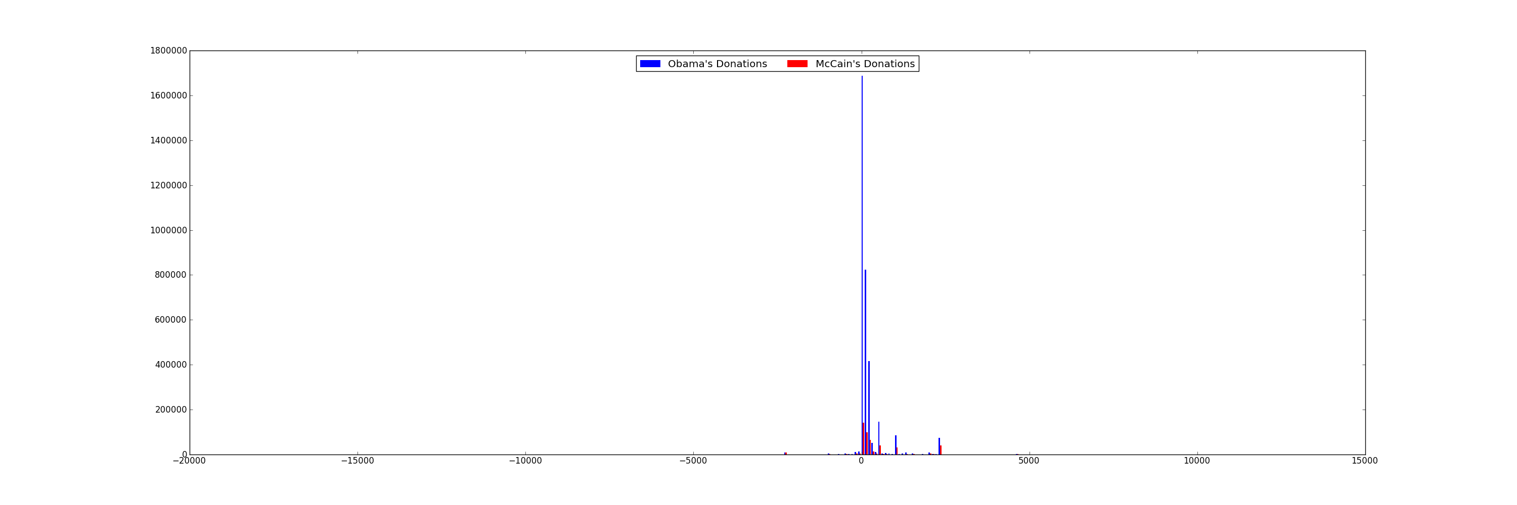
Many people say that Obama was able to attract votes from "the common man", and had far more smaller contributions that his competitors. Let's plot a histogram of each candidate's contribution amounts in $100 increments to see if this is the case. A histogram breaks a data range (donation amounts, in this case) into fixed size buckets (100 in this case), and counts the number of items that fall into each bucket. Plot both candidates on the same graph. You'll want to use a bar chart.
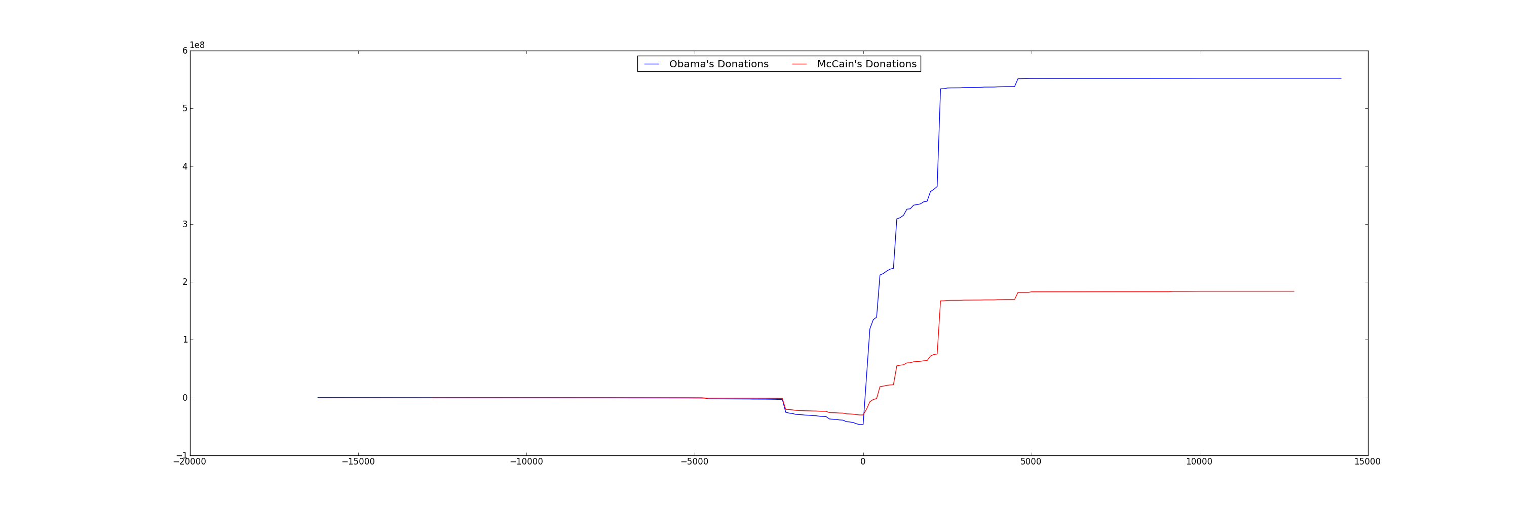
You'll find that it's difficult to read the previous chart because the donation amounts vary from -$1 Million to $8 Million, while the majority of the donations are less than 2000. One method is to ignore the outliers and focus on the majority of the data points. Let's only print histogram buckets within 3 standard deviations of the overall average donation.
For Obama, that's donations between [-$18000, $19000]. For McCain, that's between [-$22000, $22000]
Now create a cumulative line graph of Obama and McCain's donations. The x-axis should be the donation amount, and the y-axis should be the cumulative donations up to that amount.
We can see that even though Obama and McCain have some very large contributions, the vast majority of their total donations were from small contributors. Also, not only did Obama get more donations, he also received larger donations.
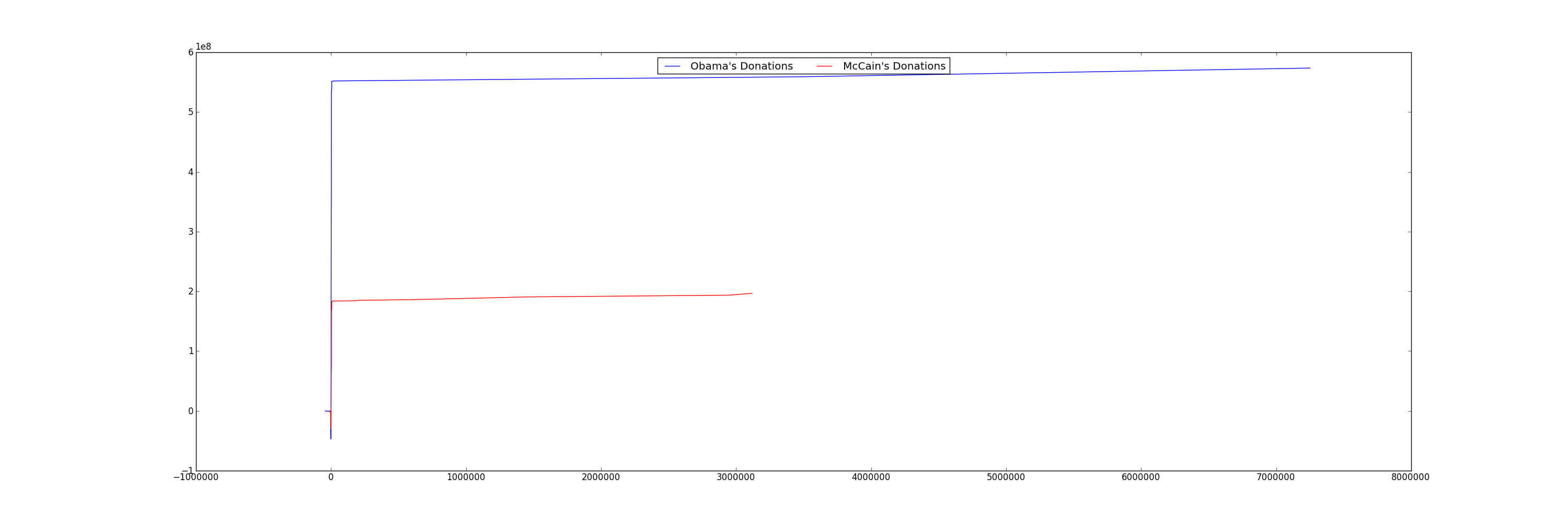
Only after we've verified that the small donations were the major contributors, is it safe to zoom in on the graph! Use the ranges in the previous exercise.
Scatter plot of re-attribution by spouses for all candidates. Find all re-attribution by spouses data points for each candidate and plot them on a scatter plot. The x-axis is the donation date and the y-axis is the donation amount.
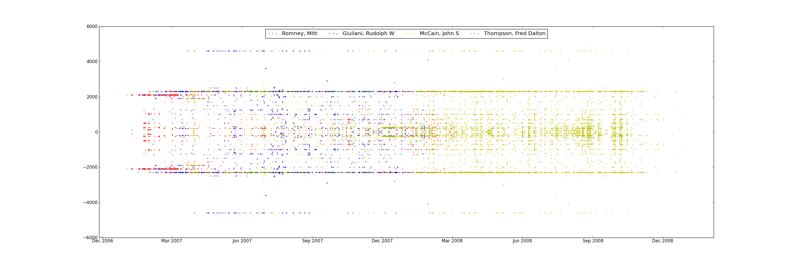
It seems to be concentrated in a small group of Republican candidates.
At this point, we've only scratched the surface of one dimension (reattributions) of this interesting dataset. You could continue our investigation by correlating professions with candidates, visualize donations by geography, or see if there are any more suspicious and interesting data points.
For example, which professions and companies are using this "re-attribution to spouse" trick?
Also, the 2012 campaign contributions are also available on the website, so you could use your analysis on the current election!
Now create a figure where each subgraph plots the total amount of per-state donations to a candidate. Thus, if there are 5 candidates (for example), there would be 5 subplots.
The tricky part is mapping the donation amount to a color. Here's some sample code to pick a shade of blue depending on the value of a donation between 0 and MAXDONATION. The bigger index means a darker shade.
# this creates an array of grey colors from white to black
colors = ['0','1','2','3','4','5','6','7','8','9','a', 'b', 'c', 'd', 'e', 'f']
colors = map(lambda s: '#%s' % (s*6), colors)
colors.sort(reverse=True)

# assume MAXDONATION was defined
# assume curdonation is the donation to pick a color for
ratio = (curdonation/float(MAXDONATION))
color_idx = int( ratio * (len(colors) - 1) )
colors[color_idx]
Using this, you should be able to create something like the following:
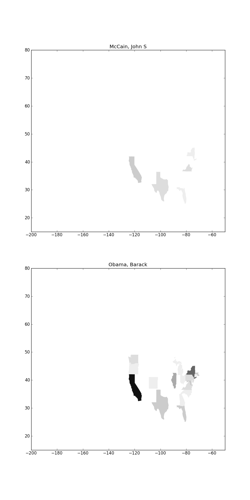
You'll notice that if you plot more candidates, they are very difficult to see because their donations are eclipsed by Obama's. One way is to use a log scale instead of a linear scale when mapping donations
Here's some sample code for computing a log
import math
math.log(100) # log of 100
Now you have hands on experience with the most popular python plotting library! Matplotlib is far more power than what we have covered. To cover the general process of using visualizations:
We only covered a small number of core visualizations in this lab. There are lots of other types of visualizations specialized for different domains. A few of them are listed below.
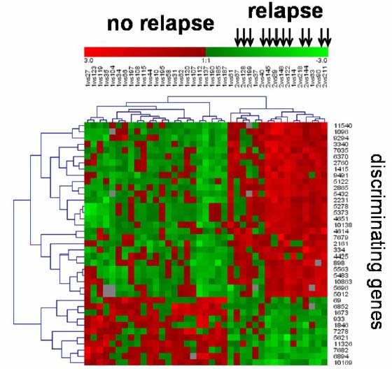
Gene Expression Matrix
Gene expression matrixes can be used to show correlations between genes and properties of patients. Here is one:
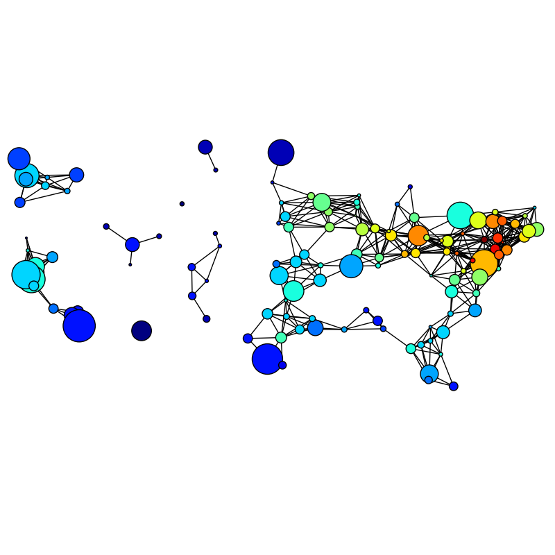
Network Graphs
Plotting graphs of social networks is a topic unto itself, and isn't well supported in matplotlib. There are other libraries for drawing them, but we unfortunately don't have the time to talk about it in this class. If you're interested, one useful network graphing library is NetworkX. Here's an example of a network graph overlayed on a map:
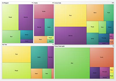
TreeMaps
A Treemap helps summarize relative proportions of a whole. Here's a treemap of financial markets. You can make treemaps in matplotlib.
Some other visualization tools. A few are in python, and many are in other languages like javascript or java.
canvas much much easier.